
Vue复刻华为官网 (二)
文章目录
- 1 推荐信息
- 1.1 思路
- 1.2 代码
- 1.3 知识补充
- 1.4 效果图
- 2 宣传海报
- 2.1 思路
- 2.2 代码
- 2.3 效果图
- 3 新闻与活动
- 3.1 思路
- 3.2 代码
- 3.3 效果图
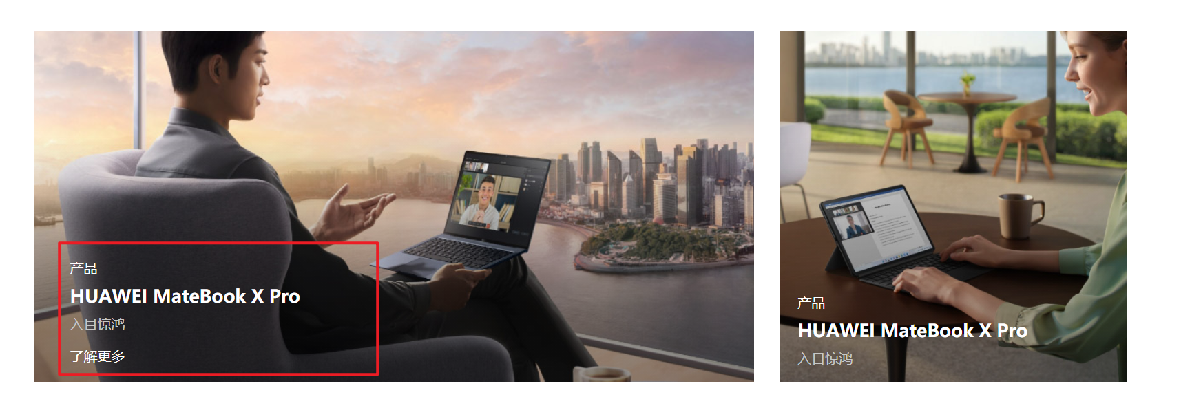
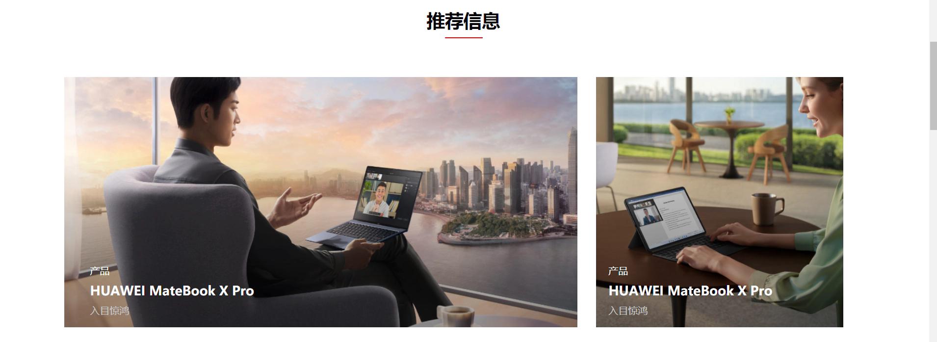
1 推荐信息
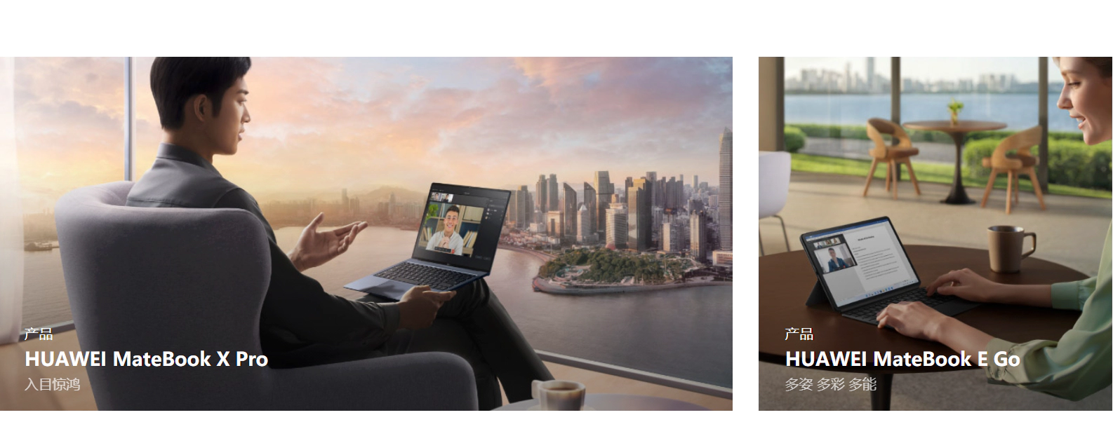
1.1 思路
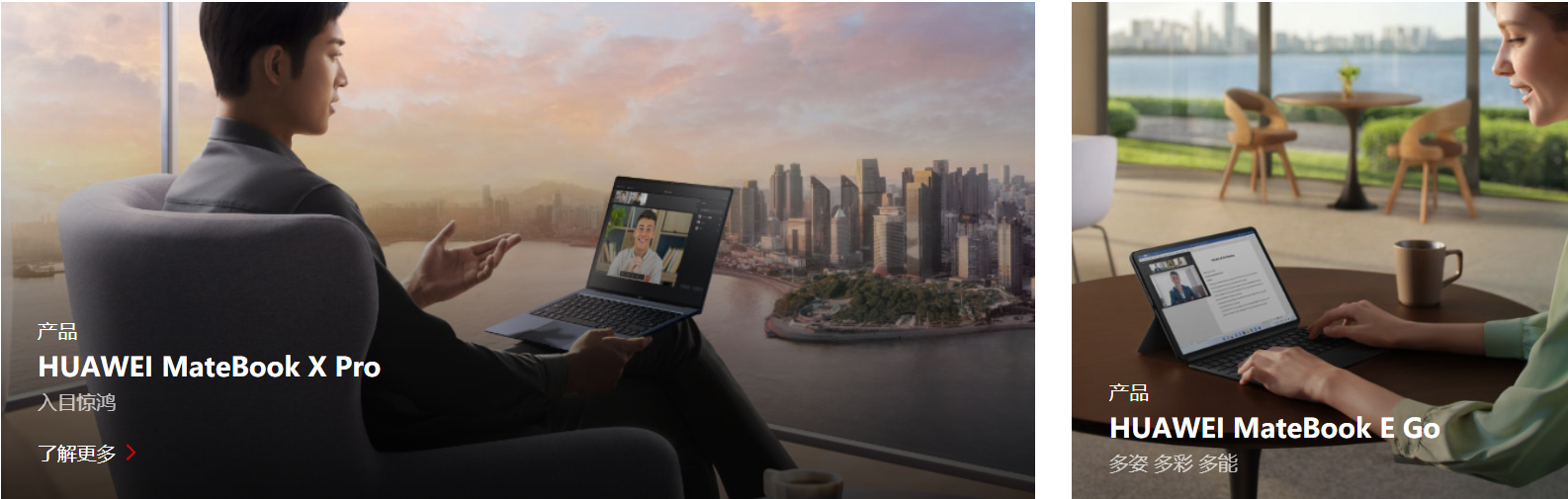
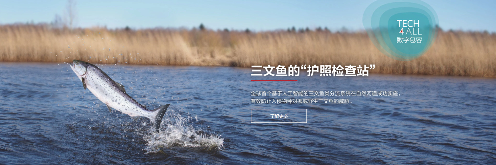
看了这个gif后,可以清楚的看到产生了三个动画效果:图片"拉近","了解更多"从下往上显示出来,阴影。
我看了华为官网的源代码,发现图片本身就是有一个mask的,这样能让图片看起来暗一些,也就意味着,当鼠标进入的时候,只需要让mask的背景颜色更深一些,就实现了阴影的效果。至于图片"拉近",我早就写过了,无非是把图片放大,然后超出盒子的不显示,这个也容易。但了解更多显现,难度就大了一些。我想了很久,最后只有通过位置,来把"了解更多"显示出来,想过用visibility: visible;但效果不太好,也想过用Vue的过渡效果,但是好像又不能同时产生三个效果。所以笨人先用笨法,先能实现再说。
1.2 代码
这里需要提一下,由于需要操作的是多个div,我用了根据类名操作Dom的方式,所以需要传一下是第几个Dom
methods: {showDiv1(value) {var d1 = document.getElementsByClassName('a_div2')[value - 1];// alert("悬浮上来了")d1.style.cssText = 'animation-name:example; animation-duration:0.5s;animation-fill-mode: forwards;z-index:3;'var d3 = document.getElementsByClassName('a1_img1')[value - 1];d3.style.cssText = 'animation-name:showBigImg2; animation-duration:0.5s;animation-fill-mode: forwards; 'var d2 = document.getElementsByClassName('mask')[value - 1];d2.style.cssText = ' z-index:2; background: linear-gradient(rgba(0, 0, 0, 0) 0%, rgba(0, 0, 0, 0.4) 70%);'},hideDiv1(value) {var d1 = document.getElementsByClassName('a_div2')[value - 1];d1.style.cssText = ' animation-name:backwards; animation-duration:0.5s;animation-fill-mode: forwards;z-index:3;';var d3 = document.getElementsByClassName('a1_img1')[value - 1];d3.style.cssText = 'animation-name:cancelBigImg2; animation-duration:0.5s;animation-fill-mode: forwards; 'var d2 = document.getElementsByClassName('mask')[value - 1];d2.style.cssText = 'background: linear-gradient(rgba(0, 0, 0, 0) 0%, rgba(0, 0, 0, 0.3) 70%);z-index:2;'// d1.style.cssText = ' animation-name:backwards; animation-duration:0.5s;animation-fill-mode: forwards;';}}
要记得设置一下mask的z-index级别(比图片大即可),不然在图片放大的过程中,mask会被遮挡住,这样就实现不了阴影的效果,而且很突兀。
.div_container {width: 85.652%;/* border: 1px solid; */margin: 0 auto;text-align: center;
}.div_title {width: 100%;height: 100%;margin-bottom: 5%;
}.title_h2 {width: 10%;height: 90%;padding-bottom: 8px;font-size: 30px;margin: 0 auto;position: relative;
}.title_h2::after {position: absolute;content: '';height: 2px;width: 47%;top: 100%;left: 27%;background-color: #c7000b;}.container_imgs {height: auto;width: 100%;}.div_row1 {height: auto;width: 100%;display: flex;margin-bottom: 30px !important;overflow: hidden;}.div_row3 {height: auto;width: 100%;display: flex;margin-bottom: 30px !important;}.row1_col1 {width: 836.98px;height: auto;position: relative;margin-right: 30px;z-index: 3;
}.row1_col3 {width: 836.98px;height: auto;position: relative;margin-left: 30px;z-index: 3;
}.col1_a1 {width: 100%;height: auto;}.a1_img1 {width: 100%;height: 100%;}.a_div1 {width: 100%;height: 100%;overflow: hidden;}.mask {position: absolute;top: 30%;width: 100%;height: 70%;opacity: 1;background: linear-gradient(rgba(0, 0, 0, 0) 0%, rgba(0, 0, 0, 0.3) 70%);
}.row1_col2 {width: 403.24px;height: auto;position: relative;overflow: hidden;z-index: 3;/* border: 2px solid sienna; */
}.col2_displacement {margin-left: 30px;
}/* 从-30px到10px */
.a_div2 {width: 90%;height: auto;padding: 0% 5%;bottom: -30px;position: absolute;display: inline-block;left: 0px;/* border: 1px solid purple; */text-align: left;}.div2_title {font-size: 1em;line-height: 1.0em;margin-bottom: 10px;color: white;
}.div2_info {font-size: 1.3em;line-height: 1.4em;font-weight: 600;margin-bottom: 10px;color: white;
}.div2_info2 {font-size: 1em;line-height: 1.0em;margin-bottom: 20px;color: rgb(198, 199, 199);
}.div2_hidden {color: white;height: 20px;line-height: 20px;visibility: visible;margin-bottom: 10px;}
1.3 知识补充
在写这个效果的时候,我遇到了一个很大的问题,就是鼠标一旦离开这个框(如下)的位置,动画效果就会被取消。我尝试了各种方法都无济于事。起初我以为是子组件遮挡住了父组件导致,所以一度往如何让子组件彻底变成父组件的一部分上思考。但后来搜索Vue中的鼠标事件的时候,得到了解决。
原因是因为最开始我用了mouseout鼠标事件,而mouseout事件一旦离开父元素或者子元素都会触发,所以鼠标离开子元素的时候,也会触发父元素上的mouseout鼠标事件,但是mouseleave则不同,只有离开被选元素的时候,才会触发效果,这样遇到的问题就被完美解决了。
1.4 效果图
2 宣传海报
![[外链图片转存失败,源站可能有防盗链机制,建议将图片保存下来直接上传(img-dk3ddPZr-1666695192048)(https://gitee.com/you-tanzhi/pic/raw/master/image-20221025171927659.png)]](/uploadfile/202401/862bbc10a8bd847.png)
2.1 思路
这个实现起来很容易,"了解更多"按钮和父组件分别使用position:absolute , position:relative,然后"了解更多"按钮相对于父组件定位,利用top和left(或者bottom、right)定位,将其放置在合适的位置。
至于"了解更多"的悬浮效果,则通过:hover即可实现
2.2 代码
![]()
.div_bill {width: 100%;margin-top: 7%;height: auto;position: relative;
}.bill_img {width: 100%;height: auto;
}.img_btn {z-index: 100;width: 170px;height: 42px;position: absolute;border: 1px solid #ffffff;left: 50.6%;top: 65%;color: #ffffff;cursor: pointer;/* opacity: 1; */background-color: rgba(11, 11, 11, 0);
}.img_btn:hover {background-color: rgb(199, 0, 11);border: 0px;color: #fff;
}
2.3 效果图
3 新闻与活动
3.1 思路
首先是分成三个组件,宽度为30%,中间两个间距分别为5%。
第一第二两个组件的形式一样,都是分成三大部分:展会活动、图片、内容信息。
其中展会活动很显然用到了相对父组件定位,图片和内容使用普通定位即可
另外,当鼠标悬浮上去的时候,图片会被拉近,而内容信息的颜色会变深一些。
当然这个也不是很难,大多数都是用过的知识。
对于第三个组件,相对复杂一些。所谓相对复杂,也不过是因为一个hover实现不了这个效果。因为如果用悬浮的话,要求两个字体的color都需要继承父组件,但是这样的话,就不能保证两个字体的颜色不同,所以需要用到一个鼠标事件,对两者的Dom进行操作实现。
3.2 代码
新闻与活动
展会活动![]() 华为全联接大会2022 线上直播 & 深圳 2022年11月7日 - 9日华为全联接大会2022之旅中国站将在深圳正式开启,本届大会的主题为“释放数字生产力”。展会活动
华为全联接大会2022 线上直播 & 深圳 2022年11月7日 - 9日华为全联接大会2022之旅中国站将在深圳正式开启,本届大会的主题为“释放数字生产力”。展会活动![]() 2020全球移动宽带论坛 泰国,曼谷 2022年10月25日 - 26日2022全球移动宽带论坛将携手产业合作伙伴GSMA和GTI于10月25-26日在泰国曼谷举办,本届大会主题为“5G引领飞跃 | 5G Leads the Stride”。新闻
2020全球移动宽带论坛 泰国,曼谷 2022年10月25日 - 26日2022全球移动宽带论坛将携手产业合作伙伴GSMA和GTI于10月25-26日在泰国曼谷举办,本届大会主题为“5G引领飞跃 | 5G Leads the Stride”。新闻5G引领飞跃
2022年10月24日中国联通和华为共同荣获5G World峰会“5G专网产业领导力奖”
2022年10月24日华为发布麦克斯韦平台和X2天线,助力5G高效部署
2022年10月24日50G PON引领创新,华为荣获2022世界宽带论坛“卓越FTTH解决方案”大奖
2022年10月24日华为主存储连续7年入选Gartner领导者象限
2022年10月24日
methods:{showDiv2(value) {var d1 = document.getElementsByClassName('info1')[value - 1];d1.style.cssText = 'background-color: rgba(242,242,242); ';var d3 = document.getElementsByClassName('main_img')[value - 1];d3.style.cssText = 'animation-name:showBigImg; animation-duration:0.5s;animation-fill-mode: forwards; '},hideDiv2(value) {var d1 = document.getElementsByClassName('info1')[value - 1];d1.style.cssText = '  background-color: rgba(248,248,248); ';var d3 = document.getElementsByClassName('main_img')[value - 1];d3.style.cssText = 'animation-name:cancelBigImg; animation-duration:0.5s;animation-fill-mode: forwards; '},changeColor(value) {var d1 = document.getElementsByClassName('info_word')[value - 1];d1.style.cssText = '  color: rgb(199, 0, 11);';var d3 = document.getElementsByClassName('info_time')[value - 1];d3.style.cssText = 'color: rgb(199, 0, 11);'},cancelColor(value) {var d1 = document.getElementsByClassName('info_word')[value - 1];d1.style.cssText = ' color:#111111;  ';var d3 = document.getElementsByClassName('info_time')[value - 1];d3.style.cssText = 'color: #333;'}
}
.div_news {width: 85.652%;margin: 0 auto;height: auto;margin-top: 5%;
}.news_title {width: 100%;height: auto;margin-bottom: 5%;}.news_title h2 {padding: 0 0;position: relative;width: 10%;margin: 0 auto;line-height: 40px;
}.news_title h2::after {position: absolute;content: '';height: 2px;width: 47%;top: 100%;left: 25%;background-color: #c7000b;
}.news_info {width: 100%;height: 65vh;position: relative;
}.info1 {width: 30%;float: left;height: 65vh;margin-right: 5%;background-color: rgba(248, 248, 248);cursor: pointer;}.info_main {width: 100%;height: auto;overflow: hidden;}.info_main img {width: 100%;height: 35vh;
}.info_words {width: 100%;height: 30vh;}.words_container {padding: 5% 5%;width: 90%;height: 90%;/* display: inline-block; */
}.container_first {width: 100%;height: auto;
}.container_first span {font-size: 18px;font-weight: 600;line-height: 34px;
}.container_second {width: 100%;font-size: 15px;margin-top: 3%;line-height: 30px;height: auto;
}.container_third {width: 100%;font-size: 14px;margin-top: 5%;line-height: 23px;color: #555;
}.info3 {width: 30%;float: right;height: 65vh;position: relative;overflow: inherit;/* border-bottom: 1px solid red; */background-color: rgba(248, 248, 248);
}.info_info1 {padding: 3% 5%;width: 90%;height: auto;cursor: pointer;color: #666;
}.info1_top {margin-top: 10%;
}.info_word {padding: 0px 0px;margin: 0px 0px;font-size: 17px;color: #111111;
}.info_time {color: inherit;
}.info_title {width: 7%;height: 5vh;position: absolute;line-height: 5vh;top: 0;text-align: center;font-size: 10px;color: #ffffff;z-index: 2;background-color: rgba(90, 90, 90, 0.7);
}.f2 {width: 20%;}
3.3 效果图
![[外链图片转存失败,源站可能有防盗链机制,建议将图片保存下来直接上传(img-uzJvxyO1-1666695192054)(../../桌面文件/1012/Honeycam 2022-10-25 18-50-36.webp)]](/uploadfile/202401/6a636f11f60b3d8.webp)
上一篇:张晓:含泪奔跑的阳光男孩
下一篇:老师脚下有半包香烟