

echarts入门到实战
官网地址:Apache ECharts
前言
我们应该经常看到或听到”数据可视化“这个词,他其实就是将数据通过各种图表更加直观的展现变化趋势,对比,峰值等等。数据可视化也是未来的趋势。
作为前端程序员,数据可视化也是我们必备的一个技能,怎么获取这个技能呢,其实我们只需要掌握一个图表库即可。目前,最常用的图表库是echarts。下面就从三个方面去认识这个图表库
1.helloworld
->代码层面:有一个整体的印象
->看到效果,可以激发我们的学习兴趣
2.整体认知
->对主干知识进行一一解说
->新手不至于迷失在海量的api中
->达到效果:对echarts有一个整体的认知,而不是零散的知识
3.实战开发
->模拟工作中开发图表的过程
->注意:工作中开发一定不是一行一行代码敲出来的,一定有技巧的,这个后面具体再讲
helloworld
1.安装:npm install echarts --save
2.引入:import * as echarts from 'echarts';
3.初始化:
// 基于准备好的dom,初始化echarts实例
var myChart = echarts.init(document.getElementById('main'));
4设置配置项:
myChart.setOption({
xAxis: { data: ['衬衫', '羊毛衫', '雪纺衫', '裤子', '高跟鞋', '袜子'] },
yAxis: {},
series: [
{ name: '销量',
type: 'bar',
data: [5, 20, 36, 10, 10, 20]
}
]
});
整体认知
下面就是从echarts中抽离出来的主干知识:
图表容器,样式,数据集,数据转换,坐标轴,视觉映射,图例,事件与行为
①图表容器
这里和我们vue非常类似,就是我们定义一个图表实例后,应该将这个实例挂载到哪个dom元素节点上。这样才能在浏览器渲染出来。
var myChart = echarts.init(document.getElementById('main'));
②样式
样式是图表的重中之重,图表就是通过视觉表达数据的。所以这一块我们要好好了解一下
①颜色主题(Theme)
最简单的更改全局样式的方式,是直接采用颜色主题(theme)
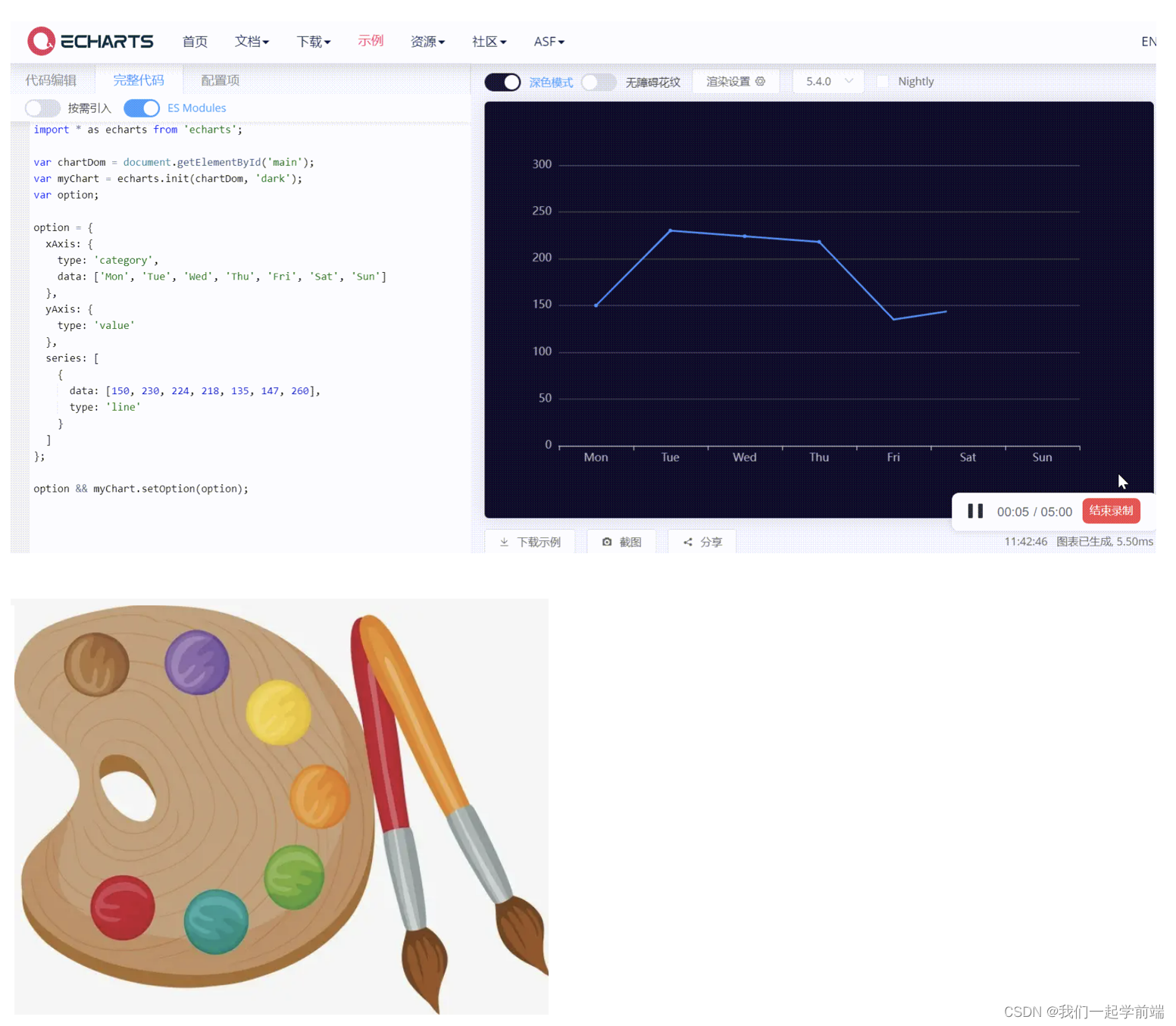
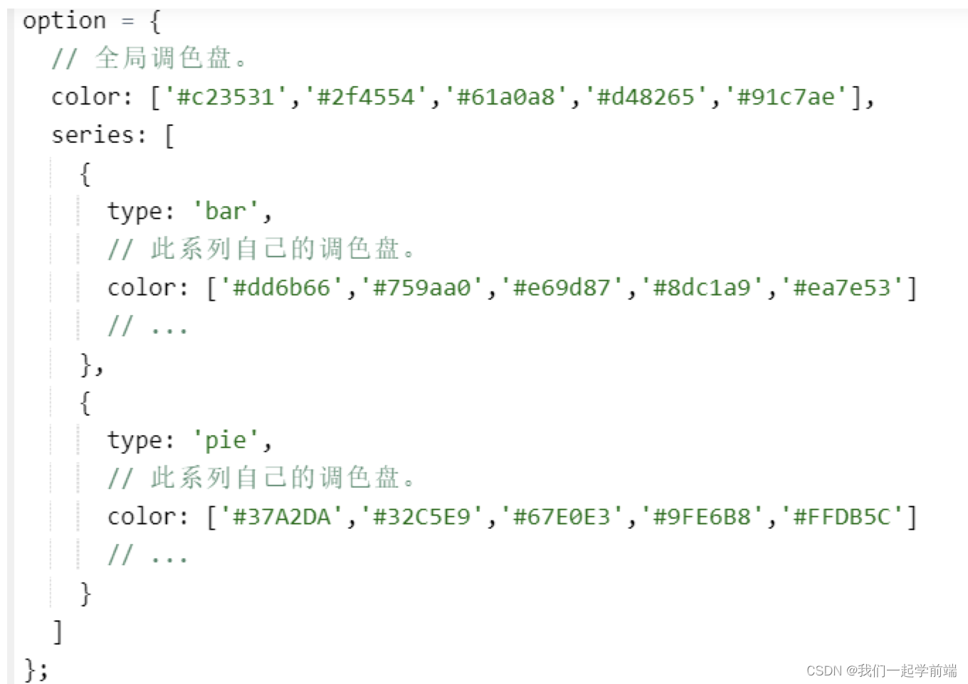
②调色盘
具体见下图
③直接样式设置(itemStyle、lineStyle、areaStyle、label、...)
这一部分是重点,我们直接通过api文档来了解一下这些配置,看看哪些地方用到了style相关的配置。
④视觉映射(visualMap)
通过下方案例学习一下
视觉映射代码:
option = {visualMap:{// show:false,min:0,max:40,inRange:{color: ['red', 'blue', 'yellow'],}},series: [{name: 'Nightingale Chart',type: 'pie',radius: [50, 250],center: ['50%', '50%'],roseType: 'area',itemStyle: {borderRadius: 8},data: [{ value: 40, name: 'rose 1' },{ value: 38, name: 'rose 2' },{ value: 32, name: 'rose 3' },{ value: 30, name: 'rose 4' },{ value: 28, name: 'rose 5' },{ value: 20, name: 'rose 6' },{ value: 10, name: 'rose 7' },{ value: 5, name: 'rose 8' }]}]
};
③数据集
数据集(dataset)是专门用来管理数据的组件。虽然每个系列都可以在 series.data 中设置数据,但是从 ECharts4 支持数据集开始,更推荐使用数据集来管理数据。因为这样,数据可以被多个组件复用,也方便进行 “数据和其他配置” 分离的配置风格。毕竟,在运行时,数据是最常改变的,而其他配置大多并不会改变。
option = {xAxis: {type: 'category',data: ['丰田', '本田', '特斯拉', '奇瑞']},yAxis: {},series: [{type: 'bar',name: '2015',data: [89.3, 92.1, 94.4, 85.4]}]
};//使用dateSetoption = {legend: {},tooltip: {},dataset: {// 提供一份数据。source: [['产品', '2015'],['丰田', 43.3],['本田', 83.1],['特斯拉', 86.4],['奇瑞', 72.4]]},// 声明一个 X 轴,类目轴(category)。默认情况下,类目轴对应到 dataset 第一列。xAxis: { type: 'category' },// 声明一个 Y 轴,数值轴。yAxis: {},// 声明 bar 系列series: [{ type: 'bar' }]
};
④数据转换
Apache EChartsTM 5 开始支持了“数据转换”( data transform )功能。在 echarts 中,“数据转换” 这个词指的是,给定一个已有的“数据集”(dataset)和一个“转换方法”(transform),echarts 能生成一个新的“数据集”,然后可以使用这个新的“数据集”绘制图表。这些工作都可以声明式地完成。
var option = {dataset: [{// 这个 dataset 的 index 是 `0`。source: [['Product', 'Sales', 'Price', 'Year'],['Cake', 123, 32, 2011],['Cereal', 231, 14, 2011],['Tofu', 235, 5, 2011],['Dumpling', 341, 25, 2011],['Biscuit', 122, 29, 2011],['Cake', 143, 30, 2012],['Cereal', 201, 19, 2012],['Tofu', 255, 7, 2012],['Dumpling', 241, 27, 2012],['Biscuit', 102, 34, 2012],['Cake', 153, 28, 2013],['Cereal', 181, 21, 2013],['Tofu', 395, 4, 2013],['Dumpling', 281, 31, 2013],['Biscuit', 92, 39, 2013],['Cake', 223, 29, 2014],['Cereal', 211, 17, 2014],['Tofu', 345, 3, 2014],['Dumpling', 211, 35, 2014],['Biscuit', 72, 24, 2014]]// id: 'a'},{// 这个 dataset 的 index 是 `1`。transform: {type: 'filter',config: { dimension: 'Year', value: 2011 }}},{// 这个 dataset 的 index 是 `2`。transform: {type: 'filter',config: { dimension: 'Year', value: 2012 }}},{// 这个 dataset 的 index 是 `3`。transform: {type: 'filter',config: { dimension: 'Year', value: 2013 }}}],series: [{type: 'pie',radius: 50,center: ['25%', '50%'],datasetIndex: 0},{type: 'pie',radius: 50,center: ['37%', '20%'],datasetIndex: 1},{type: 'pie',radius: 50,center: ['50%', '50%'],datasetIndex: 2},{type: 'pie',radius: 50,center: ['75%', '50%'],datasetIndex: 3}]
};
⑤坐标轴
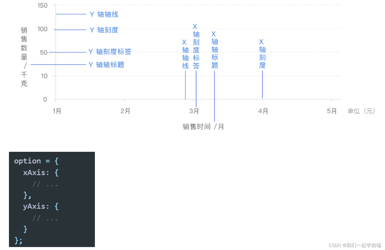
x 轴和 y 轴都由轴线、刻度、刻度标签、轴标题四个部分组成
⑥图例
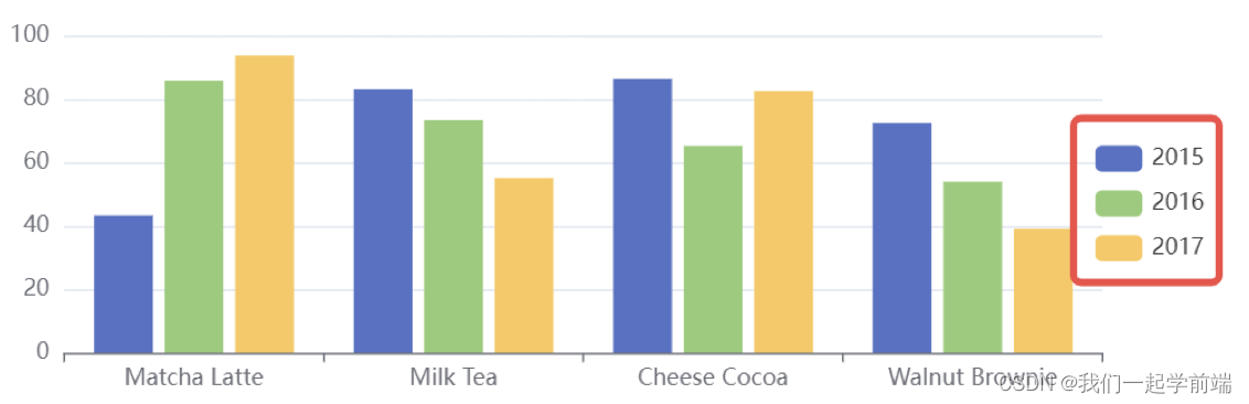
option = {legend: {// Try 'horizontal'orient: 'vertical',right: 10,top: 'center'},dataset: {source: [['product', '2015', '2016', '2017'],['Matcha Latte', 43.3, 85.8, 93.7],['Milk Tea', 83.1, 73.4, 55.1],['Cheese Cocoa', 86.4, 65.2, 82.5],['Walnut Brownie', 72.4, 53.9, 39.1]]},xAxis: { type: 'category' },yAxis: {},series: [{ type: 'bar' }, { type: 'bar' }, { type: 'bar' }]
};
⑦事件与行为
这一块也是比较重要的,但是对于有前端经验的小伙伴,事件这一块和js中的事件差不多,可以类比去理解就好了
Documentation - Apache ECharts
=====事件
=================// 指定图表的配置项和数据
var option = {xAxis: {data: ['衬衫', '羊毛衫', '雪纺衫', '裤子', '高跟鞋', '袜子']},yAxis: {},series: [{name: '销量',type: 'bar',data: [5, 20, 36, 10, 10, 20]}]
};
// 使用刚指定的配置项和数据显示图表。
myChart.setOption(option);
// 处理点击事件并且跳转到相应的百度搜索页面
myChart.on('click', function(params) {window.open('https://www.baidu.com/s?wd=' + encodeURIComponent(params.name));
});=================
=====行为
==================option = {title: {text: 'Referer of a Website',subtext: 'Fake Data',left: 'center'},tooltip: {trigger: 'item'},legend: {orient: 'vertical',left: 'left'},series: [{name: 'Access From',type: 'pie',radius: '50%',data: [{ value: 1048, name: 'Search Engine' },{ value: 735, name: 'Direct' },{ value: 580, name: 'Email' },{ value: 484, name: 'Union Ads' },{ value: 300, name: 'Video Ads' }],emphasis: {itemStyle: {shadowBlur: 10,shadowOffsetX: 0,shadowColor: 'rgba(0, 0, 0, 0.5)'}}}]
};
setTimeout(function() {myChart.dispatchAction({type: 'highlight',// 可选,数据项名称,在有 dataIndex 的时候忽略name: 'Direct',
});}, 50);
实战开发
今天带大家一起来模拟一下,我们真实开发的时候,怎么去完成我们的图表开发的
社区资源库:
EChartsDemo集
EChartsDemo集
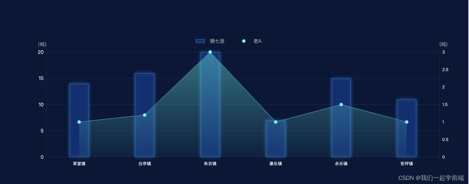
let type = ['肥料', '农药'];option = {backgroundColor: '#081736',title: {show: true,text: '',textStyle: {align: 'rigth',color: '#115CB9',fontSize: 20,},top: '3%',left: '5%',},grid: {top: "28%",right: "10%",bottom: "18%",//也可设置left和right设置距离来控制图表的大小},tooltip: {// trigger: "axis",// backgroundColor: 'rgba(17,95,182,0.5)',// textStyle: {//     color: "#fff"// },// // axisPointer: {// //     type: "line",// //     label: {// //         show: false,// //     }// // },// formatter: (pa) => {//     let oneDotHtml = ''//     let twoDotHtml = ''//     // return pa[0].name + pa[0].value//     return (//         pa[0].name + '
'//         + oneDotHtml + pa[1].seriesName + ':' + pa[1].value + "
"//         + twoDotHtml + pa[0].seriesName + ':' + pa[0].value//     );// }},dataZoom: [{show: false,xAxisIndex: 0,type: 'slider',startValue: 0,endValue: this.end}],legend: {top: "20%",left: '40%',// icon: 'rect',textStyle: {padding: [0, 0, 0, 10],color: "#aaaaaa",fontSize: 14,lineHeight: 16},itemGap: 50,itemHeight: 10,data: [{name:"钢七连",icon:'rect',itemStyle:{// color:'#aaaaaa'}},{name:"老A",icon:'circle',itemStyle:{// color:'#aaaaaa'}}]},xAxis: {data: ["草堂镇","白帝镇","朱衣镇","康乐镇","永乐镇","安坪镇"],axisLine: {show: true, //隐藏X轴轴线lineStyle: {color: '#132c5c'}},axisTick: {show: false //隐藏X轴刻度},axisLabel: {show: true,textStyle: {padding: [5, 0, 0, 0],color: "#fff" //X轴文字颜色}},},yAxis: [{type: "value",name: "(吨)",nameTextStyle: {color: "#aaaaaa",fontSize: 14,align:'right'},splitLine: {show: true,lineStyle: {color: '#132c5c'}},axisTick: {show: false},axisLine: {show: true,lineStyle: {color: '#132c5c'}},axisLabel: {show: true,textStyle: {fontSize: 14,color: "#fff"}},},{type: "value",name: "(吨)",nameTextStyle: {color: "#aaaaaa",fontSize: 14,align:'left'},position: "right",splitLine: {show: false},axisTick: {show: false},axisLine: {show: true,lineStyle: {color: '#132c5c'}},axisLabel: {show: true,textStyle: {color: "#ffffff"}}},// {//     type: "value",//     // gridIndex: 1,//     min: 50,//     max: 100,//     splitNumber: 8,//     splitLine: {//         show: false//     },//     axisLine: {//         show: false//     },//     axisTick: {//         show: false//     },//     axisLabel: {//         show: false//     },//     splitArea: {//         show: true,//         areaStyle: {//             color: ["rgba(250,250,250,0.0)", "rgba(250,250,250,0.05)"]//         }//     }// }],series: [{name: "老A",type: "line",yAxisIndex: 1, //使用的 y 轴的 index,在单个图表实例中存在多个 y轴的时候有用smooth: false, //平滑曲线显示// showAllSymbol: true, //显示所有图形。symbol: "circle", //标记的图形为实心圆symbolSize: 10, //标记的大小itemStyle: {//折线拐点标志的样式color: "#1df5ed"},lineStyle: {color: "#32749e"},areaStyle:{// color: 'transparent'//  color: ['#1df5ed','#ff0000']// color: "#1df5ed"color: new echarts.graphic.LinearGradient(0, 1, 0, 0, [{offset: 0,color: "#1df5ed11"}, {offset: 1,color: "#1df5ed99"}])},data: [1, 1.2, 3, 1, 1.5, 1]},{name: "钢七连",type: "bar",barWidth: '30%',showBackground: false,itemStyle: {borderColor:"#185294",borderWidth:2,color:'#0a2e73',shadowColor: '#185294',shadowBlur: 10,// shadowOffsetY :3,// shadowOffsetX:3// normal: {//     color: new echarts.graphic.LinearGradient(0, 1, 0, 0, [{//         offset: 0,//         color: "red"//     }, {//         offset: 0,//         color: "#1F0D5E"//     }, {//         offset: 1,//         color: "#1480C2"//     }//     ])// }},label: {normal: {show: false,textStyle: {color: '#FFF'},}},data: [14, 16, 20, 7, 15, 11]}]
};