
Tableau制作三元相图/三角图(Ternary/Triangle Chart)
三元相图
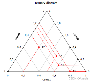
三角图就是有三个轴的坐标图,可以分别表示一个点在X、Y、Z三个维度上的不同比例情况。
与传统的XY坐标轴不同。XY坐标轴是有两个维度,而且每个维度没有上下限的限制。三角图中每个维度都在0-1的范围内,按百分比划分,即最小0%,最大100%。我们的数据点都会分布在这个三角区域内。
与传统XY坐标相比的好处是,在比较数据点之间的关系时,我们可以增加多一个维度。方便查看数据点之间的关系。
而实现的原理就是通过三角函数,将三元图的坐标点转换为XY轴坐标。从下图可以看出,每个点都可以通过辅助线,画一个新的等边三角形,从而求出该点在XY轴的位置。
放一个好看的案例在这里: 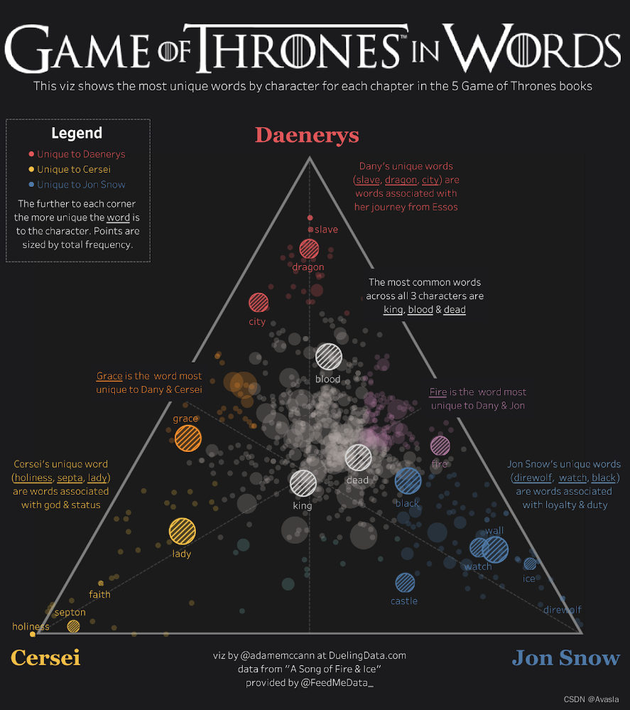
Tableau制作步骤
创建计算字段
导入样本数据Superstore之后,逐个创建计算字段:
- 先计算Orders、Quantity、Sales的百分比;
#Percentage of Total Orders
COUNTD([Order ID])/TOTAL(COUNTD([Order ID]))#Percentage of Total Quantity
SUM([Quantity]) / TOTAL(SUM([Quantity]))#Percentage of Total Sales
SUM([Sales]) / TOTAL(SUM([Sales]))
- 总的百分比:将1)步的三个值加总起来;
 #Total Percentages
[Percentage of Total Orders]+[Percentage of Total Quantity]+[Percentage of Total Sales]
- 分别求出三元值: 各维度百分比 除以总百分比
#Ternary Value: Quantity
[Percentage of Total Quantity]/[Total Percentages]#Ternary Value: Orders
[Percentage of Total Orders]/[Total Percentages]#Ternary Value: Sales
[Percentage of Total Sales]/[Total Percentages]
- 将三元值转换成X轴和Y轴上的值:
这里的计算取值由各个维度的位置决定。比如,在这里的三角形的左、上、右分别是Sales、Quantity和Orders。所以Y轴使用了Quantity(顶部维度)来计算。X轴使用Orders作为初始值。
#Y
SIN(RADIANS(60))*[Ternary Value: Quantity]#X
[Ternary Value: Orders]+([Y]/TAN(RADIANS(60)))
创建参数:控制指标维度和颜色
设置一个参数去控制指标值的颜色和大小。
- 根据下面的内容创建指标参数:Metric Parameter
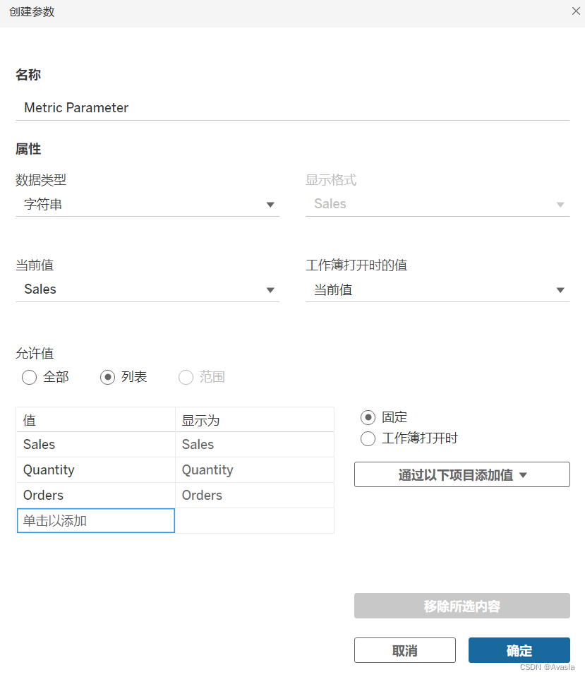
2. 创建Metric、Color两个参数:
#Metric
IF [Metric Parameter] = "Sales" THENSUM([Sales])
ELSEIF [Metric Parameter] = "Quantity" THENSUM([Quantity])
ELSECOUNTD([Order ID])
END#Color
IF [Ternary Value: Quantity]>[Ternary Value: Orders] AND [Ternary Value: Quantity]> [Ternary Value: Sales] THEN"Quantity"
ELSEIF [Ternary Value: Orders]> [Ternary Value: Quantity] AND [Ternary Value: Orders] >[Ternary Value: Sales] THEN"Orders"
ELSE"Sales"
END
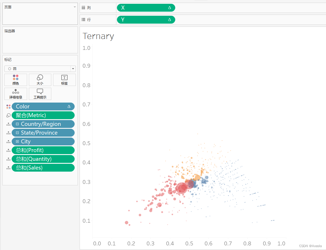
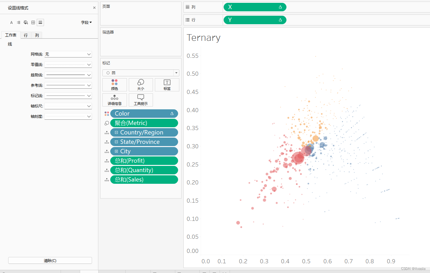
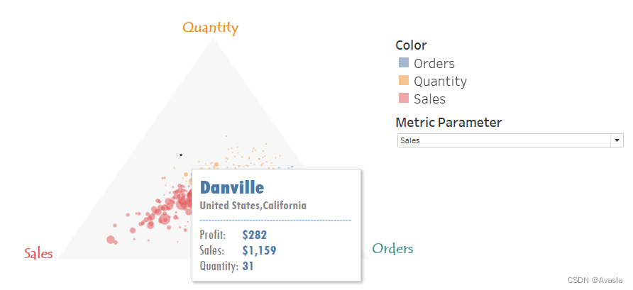
图形制作
- X、Y分别是列和行
- Metric 放在"大小"
- Color 放在"颜色"
- 地理位置放在"详细信息":一个点代表了一个城市(最小的地理位置维度)
- 补充三个数值计算总和在”详细信息“
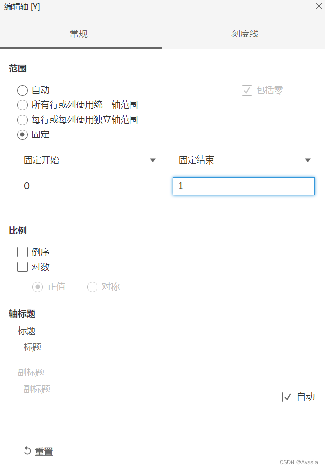
编辑轴
将X轴和Y轴的范围都设置成0到1,把轴标题删除掉
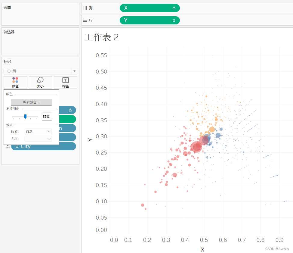
颜色、大小调整
颜色这里要调整透明度,令图案不会重叠覆盖。
网格线去除
“设置线格式”——“工作表”——“线”——“网格线"选项调整为"无”
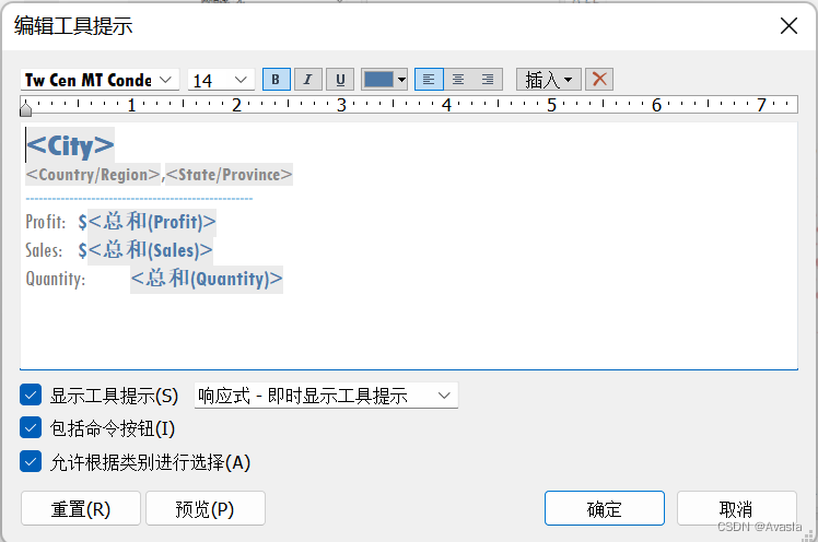
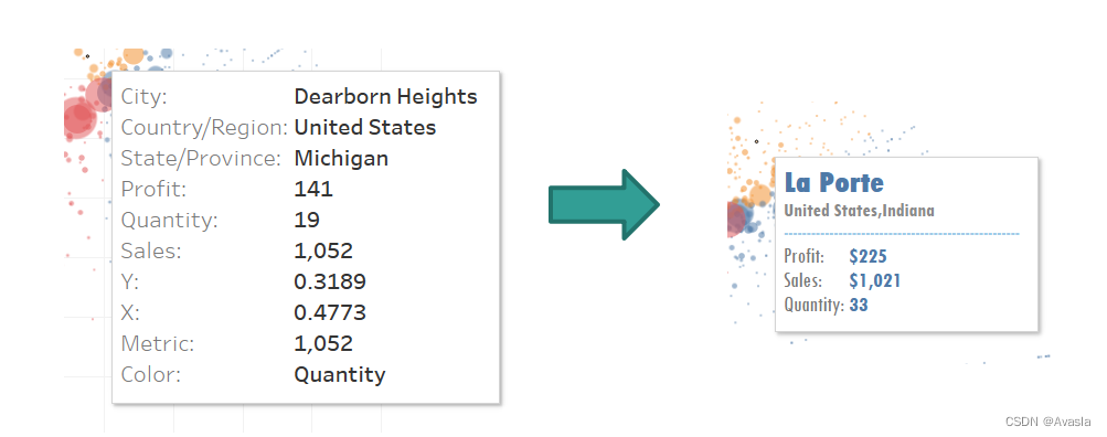
设置工具提示
点击工具提示进行格式编辑,将提示工具编辑一下,删除不用的信息。
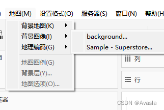
添加背景
添加背景有两种方式:第一种直接导入背景图片;第二种就是另外导入数据,用画多边形的方式画图,在搭建仪表板时候选择"浮动"模式,像是制作PPT图像一样,将两个工作表叠在一起。这里只介绍最方便实用的第一种方法。
- 打开地图——点击背景图像——选择使用的数组源Superstore
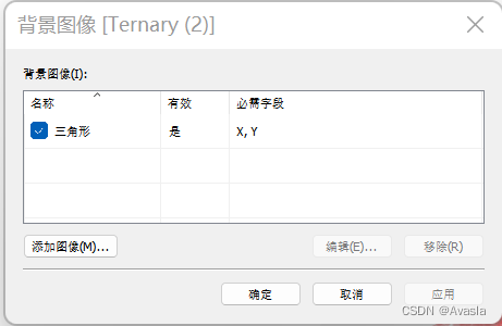
- 选择“添加图像”(添加成功的图像会在这里显示,也可以复用到其他图像上)
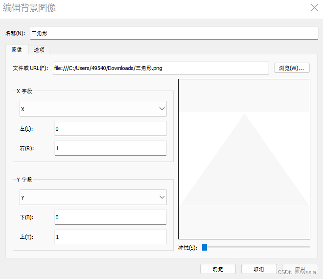
- 选择图片地址——要设定X、Y字段(右:1;上:1)——点击确定
图像根据坐标轴的位置摆放,因为坐标轴范围是【0,1】,所以要填入数据位置。
完成效果图
参考资料链接
计算原理和实现过程: https://www.flerlagetwins.com/2019/08/ternary.html
Superstore案例看板链接:https://public.tableau.com/app/profile/toan.hoang/viz/TernaryChart_15628715360680/TernaryPlot
Superstore原教程:https://tableau.toanhoang.com/creating-ternary-plots-in-tableau/
ternary graph视频教程:https://www.vizwiz.com/2021/04/ternary-graph.html