
CSS 实现灯笼动画,祝大家元旦快乐
创始人
2024-05-03 11:45:22
前言
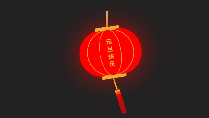
👏CSS 实现大红灯笼动画,祝大家元旦快乐,2023越来越棒!速速来Get吧~
🥇文末分享源代码。记得点赞+关注+收藏!
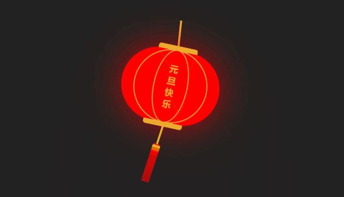
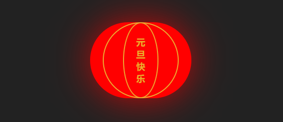
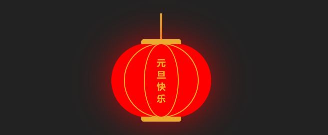
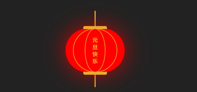
1.实现效果
2.实现步骤
- 定义一个灯笼的背景色bg,线条颜色lineColor
:root {--lineColor: #ecaa2f;--bg: #f00;
}
- 父容器container宽高设置为200px/150px
.container {width: 200px;height: 150px;position: relative;
}
- 在父容器内添加一个圆角矩形,宽高为父容器一致,设置一定的圆角与box-shadow阴影,背景色为 bg
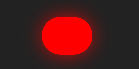
.center {position: relative;width: 100%;height: 100%;background: var(--bg);border-radius: 120px;box-shadow: 0 0 80px -10px var(--bg);
}
- 在center中添加一个标签,宽高与父容器一致,在其前后伪元素上绘制灯笼上的线条
.center-line {width: 100%;height: 100%;}
- 在center-line的前伪元素上添加一个圆环,高度与父容器一致,宽度为150px;边框设置为2px,颜色为lineColor,距离顶部为0,水平居中
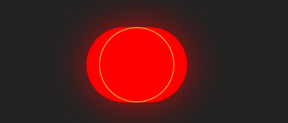
.center-line::before {content: "";position: absolute;top: 0;left: calc(50% - 75px);width: 150px;height: 150px;border: 2px solid var(--lineColor);border-radius: 50%;
}
- 在center-line的后伪元素上添加一个圆环,高度与父容器一致,宽度为70px;边框设置为2px,颜色为lineColor,距离顶部为0,水平居中
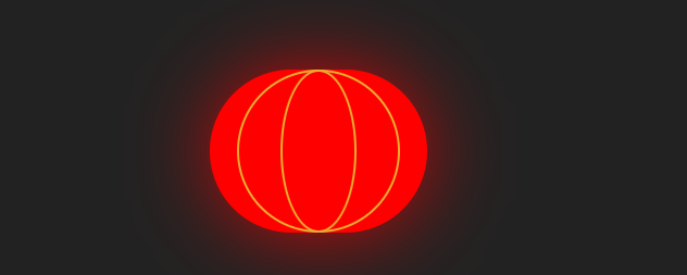
.center-line::after {content: "";position: absolute;top: 0;left: calc(50% - 35px);width: 70px;height: 150px;border: 2px solid var(--lineColor);border-radius: 50%;
}
- 在center-line中添加span标签,内容为"元旦快乐",设置宽度与字体的font-size相同,水平垂直居中,字体颜色为lineColor
元旦快乐
.center-line span {position: absolute;top: 50%;left: 50%;transform: translate(-50%, -50%);width: 18px;font-size: 18px;color: var(--lineColor);font-weight: bold;
}
- 为center容器添加前伪元素,宽高为80px/10px,背景色为lineColor,设置左上右上的一定的圆角弧度,水平居中,top设置为-8px,层级设置为2,居于最顶层
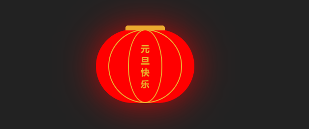
 .center::before {content: "";position: absolute;top: -8px;left: calc(50% - 40px);width: 80px;height: 10px;background: var(--lineColor);border-radius: 5px 5px 0 0;z-index: 2;
}
- 为center容器添加后伪元素,宽高为80px/10px,背景色为lineColor,设置左下右下的一定的圆角弧度,水平居中,bottom设置为-8px,层级设置为2,居于最顶层
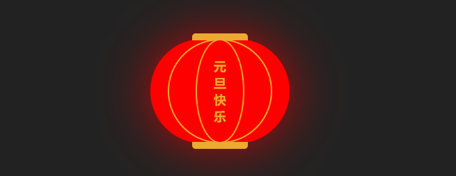
.center::after {content: "";width: 80px;height: 10px;background: var(--lineColor);border-radius: 0 0 5px 5px;position: absolute;bottom: -8px;left: calc(50% - 40px);z-index: 2;
}- 在最外层的父容器container中添加一个标签,用来绘制灯笼最上面的线条
+
.head-line {position: absolute;left: calc(50% - 2px);top: -60px;width: 4px;height: 60px;background-color: var(--lineColor);
}
- 在center中添加一个标签,用来绘制灯笼下面的线条
+
.footer-line {position: absolute;left: calc(50% - 2px);bottom: -50px;width: 4px;height: 50px;background-color: var(--lineColor);z-index: -1;
}- 为footer-line添加一个伪元素,用来绘制灯笼最下面的细须,用linear-gradient设置背景色,这样一个灯笼就绘制完成了,接下来我们给灯笼添加上动画效果
.footer-line::after {content: "";position: absolute;bottom: -75px;left: calc(50% - 8px);width: 16px;height: 80px;background: linear-gradient(#f00,#e36d00 3px,#fbd342 5px,#e36d00 8px,#e36d00 12px,#f00 16px,rgba(255, 0, 0, 0.8) 26px,rgba(255, 0, 0, 0.6));border-radius: 5px 5px 0 0;
}
- 添加rotate动画,动画的0%和100%旋转-10deg,50%的时候旋转10deg
@keyframes rotate {0%,100% {transform: rotate(-10deg);}50% {transform: rotate(10deg);}
}
- 为灯笼底部的细须添加旋转动画
.footer-line {+ animation: rotate 3s infinite ease-in-out;
}
- 为灯笼的中间区域center添加旋转动画
.center {+ animation: rotate 3s infinite ease-in-out;
}
- 可以看到,灯笼中间与上方线条之间摆动的幅度太大,为center设置transform-origin
.center {+ transform-origin: top center;
}
- 为最外层父容器添加旋转动画,就实现好了啦~
.container {+  animation: rotate 3s infinite ease-in-out;
}
3.实现代码
CSS 实现灯笼动画 元旦快乐
4.写在最后🍒
🍡提前祝大家元旦快乐,2023越来越棒!🍪
看完本文如果觉得对你有一丢丢帮助,记得点赞+关注+收藏鸭 🍕
更多相关内容,关注🍥苏苏的bug,🍡苏苏的github,🍪苏苏的码云~
相关内容
热门资讯
埃菲尔铁塔在哪 中国仿建埃菲尔...
2019年4月26日,广西南宁市,街头惊现一座巨型山寨版埃菲尔铁塔,高约20米,白色塔身,造型逼真,...
苗族的传统节日 贵州苗族节日有...
【岜沙苗族芦笙节】岜沙,苗语叫“分送”,距从江县城7.5公里,是世界上最崇拜树木并以树为神的枪手部落...
北京的名胜古迹 北京最著名的景...
北京从元代开始,逐渐走上帝国首都的道路,先是成为大辽朝五大首都之一的南京城,随着金灭辽,金代从海陵王...
长白山自助游攻略 吉林长白山游...
昨天介绍了西坡的景点详细请看链接:一个人的旅行,据说能看到长白山天池全凭运气,您的运气如何?今日介绍...
应用未安装解决办法 平板应用未...
---IT小技术,每天Get一个小技能!一、前言描述苹果IPad2居然不能安装怎么办?与此IPad不...
脚上的穴位图 脚面经络图对应的...
人体穴位作用图解大全更清晰直观的标注了各个人体穴位的作用,包括头部穴位图、胸部穴位图、背部穴位图、胳...
猫咪吃了塑料袋怎么办 猫咪误食...
你知道吗?塑料袋放久了会长猫哦!要说猫咪对塑料袋的喜爱程度完完全全可以媲美纸箱家里只要一有塑料袋的响...
demo什么意思 demo版本...
618快到了,各位的小金库大概也在准备开闸放水了吧。没有小金库的,也该向老婆撒娇卖萌服个软了,一切只...
世界上最漂亮的人 世界上最漂亮...
此前在某网上,选出了全球265万颜值姣好的女性。从这些数量庞大的女性群体中,人们投票选出了心目中最美...
埃菲尔铁塔在哪 中国仿建埃菲尔...
2019年4月26日,广西南宁市,街头惊现一座巨型山寨版埃菲尔铁塔,高约20米,白色塔身,造型逼真,...
苗族的传统节日 贵州苗族节日有...
【岜沙苗族芦笙节】岜沙,苗语叫“分送”,距从江县城7.5公里,是世界上最崇拜树木并以树为神的枪手部落...
北京的名胜古迹 北京最著名的景...
北京从元代开始,逐渐走上帝国首都的道路,先是成为大辽朝五大首都之一的南京城,随着金灭辽,金代从海陵王...
长白山自助游攻略 吉林长白山游...
昨天介绍了西坡的景点详细请看链接:一个人的旅行,据说能看到长白山天池全凭运气,您的运气如何?今日介绍...
世界上最漂亮的人 世界上最漂亮...
此前在某网上,选出了全球265万颜值姣好的女性。从这些数量庞大的女性群体中,人们投票选出了心目中最美...
应用未安装解决办法 平板应用未...
---IT小技术,每天Get一个小技能!一、前言描述苹果IPad2居然不能安装怎么办?与此IPad不...
脚上的穴位图 脚面经络图对应的...
人体穴位作用图解大全更清晰直观的标注了各个人体穴位的作用,包括头部穴位图、胸部穴位图、背部穴位图、胳...
demo什么意思 demo版本...
618快到了,各位的小金库大概也在准备开闸放水了吧。没有小金库的,也该向老婆撒娇卖萌服个软了,一切只...
猫咪吃了塑料袋怎么办 猫咪误食...
你知道吗?塑料袋放久了会长猫哦!要说猫咪对塑料袋的喜爱程度完完全全可以媲美纸箱家里只要一有塑料袋的响...