第二回:艺术画笔见乾坤
import numpy as np
import pandas as pd
import re
import matplotlib
import matplotlib.pyplot as plt
from matplotlib.lines import Line2D
from matplotlib.patches import Circle, Wedge
from matplotlib.collections import PatchCollection
一、概述
1. matplotlib的三层api
matplotlib的原理或者说基础逻辑是,用Artist对象在画布(canvas)上绘制(Render)图形。
就和人作画的步骤类似:
- 准备一块画布或画纸
- 准备好颜料、画笔等制图工具
- 作画
所以matplotlib有三个层次的API:
matplotlib.backend_bases.FigureCanvas 代表了绘图区,所有的图像都是在绘图区完成的
matplotlib.backend_bases.Renderer 代表了渲染器,可以近似理解为画笔,控制如何在 FigureCanvas 上画图。
matplotlib.artist.Artist 代表了具体的图表组件,即调用了Renderer的接口在Canvas上作图。
前两者处理程序和计算机的底层交互的事项,第三项Artist就是具体的调用接口来做出我们想要的图,比如图形、文本、线条的设定。所以通常来说,我们95%的时间,都是用来和matplotlib.artist.Artist类打交道的。
2. Artist的分类
Artist有两种类型:primitives 和containers。
primitive是基本要素,它包含一些我们要在绘图区作图用到的标准图形对象,如曲线Line2D,文字text,矩形Rectangle,图像image等。
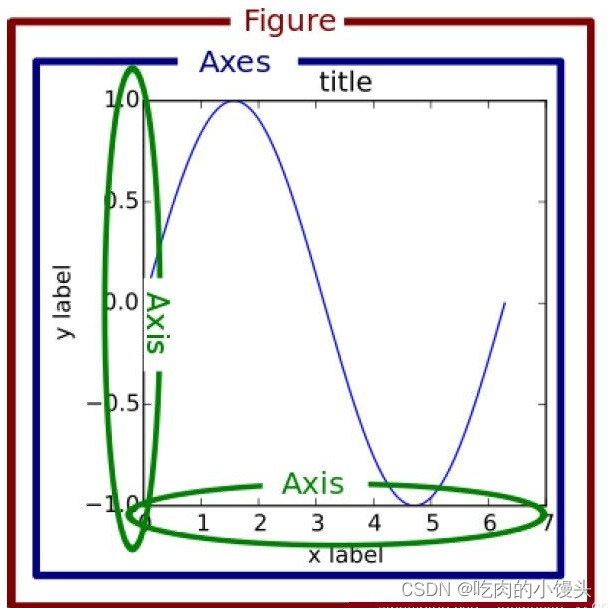
container是容器,即用来装基本要素的地方,包括图形figure、坐标系Axes和坐标轴Axis。他们之间的关系如下图所示:
可视化中常见的artist类可以参考下图这张表格,解释下每一列的含义。
第一列表示matplotlib中子图上的辅助方法,可以理解为可视化中不同种类的图表类型,如柱状图,折线图,直方图等,这些图表都可以用这些辅助方法直接画出来,属于更高层级的抽象。
第二列表示不同图表背后的artist类,比如折线图方法plot在底层用到的就是Line2D这一artist类。
第三列是第二列的列表容器,例如所有在子图中创建的Line2D对象都会被自动收集到ax.lines返回的列表中。
下一节的具体案例更清楚地阐释了这三者的关系,其实在很多时候,我们只用记住第一列的辅助方法进行绘图即可,而无需关注具体底层使用了哪些类,但是了解底层类有助于我们绘制一些复杂的图表,因此也很有必要了解。
| Axes helper method | Artist | Container |
|---|---|---|
bar - bar charts | Rectangle | ax.patches |
errorbar - error bar plots | Line2D and Rectangle | ax.lines and ax.patches |
fill - shared area | Polygon | ax.patches |
hist - histograms | Rectangle | ax.patches |
imshow - image data | AxesImage | ax.images |
plot - xy plots | Line2D | ax.lines |
scatter - scatter charts | PolyCollection | ax.collections |
二、基本元素 - primitives
各容器中可能会包含多种基本要素-primitives, 所以先介绍下primitives,再介绍容器。
本章重点介绍下 primitives 的几种类型:曲线-Line2D,矩形-Rectangle,多边形-Polygon,图像-image
1. 2DLines
在matplotlib中曲线的绘制,主要是通过类 matplotlib.lines.Line2D 来完成的。
matplotlib中线-line的含义:它表示的可以是连接所有顶点的实线样式,也可以是每个顶点的标记。此外,这条线也会受到绘画风格的影响,比如,我们可以创建虚线种类的线。
它的构造函数:
class matplotlib.lines.Line2D(xdata, ydata, linewidth=None, linestyle=None, color=None, marker=None, markersize=None, markeredgewidth=None, markeredgecolor=None, markerfacecolor=None, markerfacecoloralt=‘none’, fillstyle=None, antialiased=None, dash_capstyle=None, solid_capstyle=None, dash_joinstyle=None, solid_joinstyle=None, pickradius=5, drawstyle=None, markevery=None, **kwargs)
其中常用的的参数有:
- xdata:需要绘制的line中点的在x轴上的取值,若忽略,则默认为range(1,len(ydata)+1)
- ydata:需要绘制的line中点的在y轴上的取值
- linewidth:线条的宽度
- linestyle:线型
- color:线条的颜色
- marker:点的标记,详细可参考markers API
- markersize:标记的size
其他详细参数可参考Line2D官方文档
a. 如何设置Line2D的属性
有三种方法可以用设置线的属性。
- 直接在plot()函数中设置
- 通过获得线对象,对线对象进行设置
- 获得线属性,使用setp()函数设置
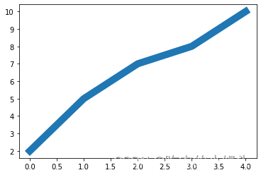
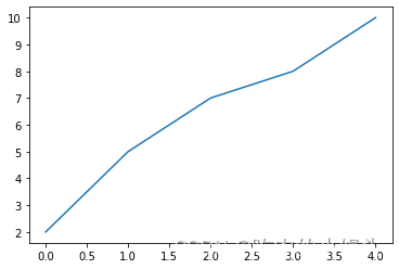
# 1) 直接在plot()函数中设置
x = range(0,5)
y = [2,5,7,8,10]
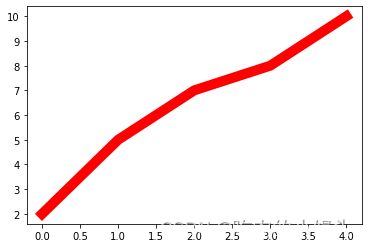
plt.plot(x,y, linewidth=10); # 设置线的粗细参数为10
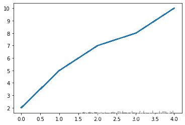
# 2) 通过获得线对象,对线对象进行设置
x = range(0,5)
y = [2,5,7,8,10]
line, = plt.plot(x, y, '-') # 这里等号坐标的line,是一个列表解包的操作,目的是获取plt.plot返回列表中的Line2D对象
line.set_antialiased(False); # 关闭抗锯齿功能
# 3) 获得线属性,使用setp()函数设置
x = range(0,5)
y = [2,5,7,8,10]
lines = plt.plot(x, y)
plt.setp(lines, color='r', linewidth=10);
b. 如何绘制lines
- 绘制直线line
- errorbar绘制误差折线图
介绍两种绘制直线line常用的方法:
- plot方法绘制
- Line2D对象绘制
# 1. plot方法绘制
x = range(0,5)
y1 = [2,5,7,8,10]
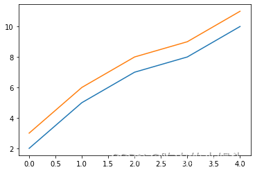
y2= [3,6,8,9,11]fig,ax= plt.subplots()
ax.plot(x,y1)
ax.plot(x,y2)
print(ax.lines); # 通过直接使用辅助方法画线,打印ax.lines后可以看到在matplotlib在底层创建了两个Line2D对象
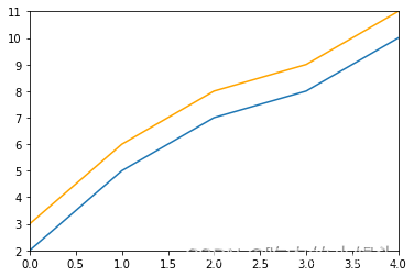
# 2. Line2D对象绘制x = range(0,5)
y1 = [2,5,7,8,10]
y2= [3,6,8,9,11]
fig,ax= plt.subplots()
lines = [Line2D(x, y1), Line2D(x, y2,color='orange')]  # 显式创建Line2D对象
for line in lines:ax.add_line(line) # 使用add_line方法将创建的Line2D添加到子图中
ax.set_xlim(0,4)
ax.set_ylim(2, 11);
2) errorbar绘制误差折线图
pyplot里有个专门绘制误差线的功能,通过errorbar类实现,它的构造函数:
matplotlib.pyplot.errorbar(x, y, yerr=None, xerr=None, fmt=‘’, ecolor=None, elinewidth=None, capsize=None, barsabove=False, lolims=False, uplims=False, xlolims=False, xuplims=False, errorevery=1, capthick=None, *, data=None, **kwargs)
其中最主要的参数是前几个:
- x:需要绘制的line中点的在x轴上的取值
- y:需要绘制的line中点的在y轴上的取值
- yerr:指定y轴水平的误差
- xerr:指定x轴水平的误差
- fmt:指定折线图中某个点的颜色,形状,线条风格,例如‘co–’
- ecolor:指定error bar的颜色
- elinewidth:指定error bar的线条宽度
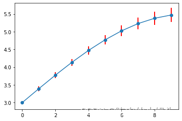
绘制errorbar
fig = plt.figure()
x = np.arange(10)
y = 2.5 * np.sin(x / 20 * np.pi)
yerr = np.linspace(0.05, 0.2, 10)
plt.errorbar(x,y+3,yerr=yerr,fmt='o-',ecolor='r',elinewidth=2);
2. patches
matplotlib.patches.Patch类是二维图形类,并且它是众多二维图形的父类,它的所有子类见matplotlib.patches API ,
Patch类的构造函数:
Patch(edgecolor=None, facecolor=None, color=None,
linewidth=None, linestyle=None, antialiased=None,
hatch=None, fill=True, capstyle=None, joinstyle=None,
**kwargs)
本小节重点讲述三种最常见的子类,矩形,多边形和楔形。
a. Rectangle-矩形
Rectangle矩形类在官网中的定义是: 通过锚点xy及其宽度和高度生成。
Rectangle本身的主要比较简单,即xy控制锚点,width和height分别控制宽和高。它的构造函数:
class matplotlib.patches.Rectangle(xy, width, height, angle=0.0, **kwargs)
在实际中最常见的矩形图是hist直方图和bar条形图。
1) hist-直方图
matplotlib.pyplot.hist(x,bins=None,range=None, density=None, bottom=None, histtype=‘bar’, align=‘mid’, log=False, color=None, label=None, stacked=False, normed=None)
下面是一些常用的参数:
- x: 数据集,最终的直方图将对数据集进行统计
- bins: 统计的区间分布
- range: tuple, 显示的区间,range在没有给出bins时生效
- density: bool,默认为false,显示的是频数统计结果,为True则显示频率统计结果,这里需要注意,频率统计结果=区间数目/(总数*区间宽度),和normed效果一致,官方推荐使用density
- histtype: 可选{‘bar’, ‘barstacked’, ‘step’, ‘stepfilled’}之一,默认为bar,推荐使用默认配置,step使用的是梯状,stepfilled则会对梯状内部进行填充,效果与bar类似
- align: 可选{‘left’, ‘mid’, ‘right’}之一,默认为’mid’,控制柱状图的水平分布,left或者right,会有部分空白区域,推荐使用默认
- log: bool,默认False,即y坐标轴是否选择指数刻度
- stacked: bool,默认为False,是否为堆积状图
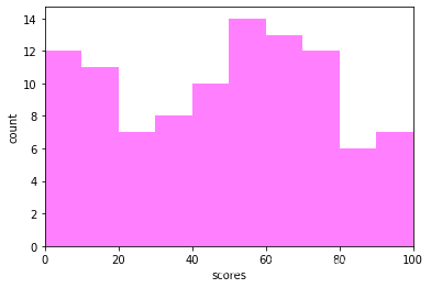
# hist绘制直方图
x=np.random.randint(0,100,100) #生成[0-100)之间的100个数据,即 数据集
bins=np.arange(0,101,10) #设置连续的边界值,即直方图的分布区间[0,10),[10,20)...
plt.hist(x,bins,color='fuchsia',alpha=0.5)#alpha设置透明度,0为完全透明
plt.xlabel('scores')
plt.ylabel('count')
plt.xlim(0,100); #设置x轴分布范围 plt.show()
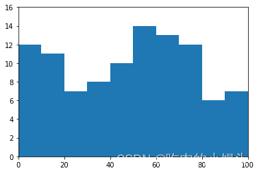
# Rectangle矩形类绘制直方图
df = pd.DataFrame(columns = ['data'])
df.loc[:,'data'] = x
df['fenzu'] = pd.cut(df['data'], bins=bins, right = False,include_lowest=True)df_cnt = df['fenzu'].value_counts().reset_index()
df_cnt.loc[:,'mini'] = df_cnt['index'].astype(str).map(lambda x:re.findall('\[(.*)\,',x)[0]).astype(int)
df_cnt.loc[:,'maxi'] = df_cnt['index'].astype(str).map(lambda x:re.findall('\,(.*)\)',x)[0]).astype(int)
df_cnt.loc[:,'width'] = df_cnt['maxi']- df_cnt['mini']
df_cnt.sort_values('mini',ascending = True,inplace = True)
df_cnt.reset_index(inplace = True,drop = True)#用Rectangle把hist绘制出来fig = plt.figure()
ax1 = fig.add_subplot(111)for i in df_cnt.index:rect =  plt.Rectangle((df_cnt.loc[i,'mini'],0),df_cnt.loc[i,'width'],df_cnt.loc[i,'fenzu'])ax1.add_patch(rect)ax1.set_xlim(0, 100)
ax1.set_ylim(0, 16);
2) bar-柱状图
matplotlib.pyplot.bar(left, height, alpha=1, width=0.8, color=, edgecolor=, label=, lw=3)
下面是一些常用的参数:
- left:x轴的位置序列,一般采用range函数产生一个序列,但是有时候可以是字符串
- height:y轴的数值序列,也就是柱形图的高度,一般就是我们需要展示的数据;
- alpha:透明度,值越小越透明
- width:为柱形图的宽度,一般这是为0.8即可;
- color或facecolor:柱形图填充的颜色;
- edgecolor:图形边缘颜色
- label:解释每个图像代表的含义,这个参数是为legend()函数做铺垫的,表示该次bar的标签
有两种方式绘制柱状图
- bar绘制柱状图
Rectangle矩形类绘制柱状图
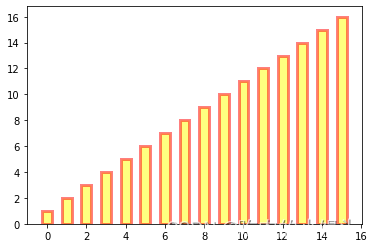
# bar绘制柱状图
y = range(1,17)
plt.bar(np.arange(16), y, alpha=0.5, width=0.5, color='yellow', edgecolor='red', label='The First Bar', lw=3);
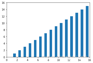
# Rectangle矩形类绘制柱状图
fig = plt.figure()
ax1 = fig.add_subplot(111)for i in range(1,17):rect =  plt.Rectangle((i+0.25,0),0.5,i)ax1.add_patch(rect)
ax1.set_xlim(0, 16)
ax1.set_ylim(0, 16);
b. Polygon-多边形
matplotlib.patches.Polygon类是多边形类。它的构造函数:
class matplotlib.patches.Polygon(xy, closed=True, **kwargs)
xy是一个N×2的numpy array,为多边形的顶点。
closed为True则指定多边形将起点和终点重合从而显式关闭多边形。
matplotlib.patches.Polygon类中常用的是fill类,它是基于xy绘制一个填充的多边形,它的定义:
matplotlib.pyplot.fill(*args, data=None, **kwargs)
参数说明 : 关于x、y和color的序列,其中color是可选的参数,每个多边形都是由其节点的x和y位置列表定义的,后面可以选择一个颜色说明符。您可以通过提供多个x、y、[颜色]组来绘制多个多边形。
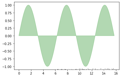
# 用fill来绘制图形
x = np.linspace(0, 5 * np.pi, 1000)
y1 = np.sin(x)
y2 = np.sin(2 * x)
plt.fill(x, y1, color = "g", alpha = 0.3);
c. Wedge-契形
matplotlib.patches.Wedge类是楔型类。其基类是matplotlib.patches.Patch,它的构造函数:
class matplotlib.patches.Wedge(center, r, theta1, theta2, width=None, **kwargs)
一个Wedge-楔型 是以坐标x,y为中心,半径为r,从θ1扫到θ2(单位是度)。
如果宽度给定,则从内半径r -宽度到外半径r画出部分楔形。wedge中比较常见的是绘制饼状图。
matplotlib.pyplot.pie语法:
matplotlib.pyplot.pie(x, explode=None, labels=None, colors=None, autopct=None, pctdistance=0.6, shadow=False, labeldistance=1.1, startangle=0, radius=1, counterclock=True, wedgeprops=None, textprops=None, center=0, 0, frame=False, rotatelabels=False, *, normalize=None, data=None)
制作数据x的饼图,每个楔子的面积用x/sum(x)表示。
其中最主要的参数是前4个:
- x:楔型的形状,一维数组。
- explode:如果不是等于None,则是一个len(x)数组,它指定用于偏移每个楔形块的半径的分数。
- labels:用于指定每个楔型块的标记,取值是列表或为None。
- colors:饼图循环使用的颜色序列。如果取值为None,将使用当前活动循环中的颜色。
- startangle:饼状图开始的绘制的角度。
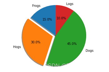
# pie绘制饼状图
labels = 'Frogs', 'Hogs', 'Dogs', 'Logs'
sizes = [15, 30, 45, 10]
explode = (0, 0.1, 0, 0)
fig1, ax1 = plt.subplots()
ax1.pie(sizes, explode=explode, labels=labels, autopct='%1.1f%%', shadow=True, startangle=90)
ax1.axis('equal'); # Equal aspect ratio ensures that pie is drawn as a circle.
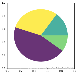
# wedge绘制饼图
fig = plt.figure(figsize=(5,5))
ax1 = fig.add_subplot(111)
theta1 = 0
sizes = [15, 30, 45, 10]
patches = []
patches += [Wedge((0.5, 0.5), .4, 0, 54),           Wedge((0.5, 0.5), .4, 54, 162),  Wedge((0.5, 0.5), .4, 162, 324),           Wedge((0.5, 0.5), .4, 324, 360),
]
colors = 100 * np.random.rand(len(patches))
p = PatchCollection(patches, alpha=0.8)
p.set_array(colors)
ax1.add_collection(p);
3. collections
collections类是用来绘制一组对象的集合,collections有许多不同的子类,如RegularPolyCollection, CircleCollection, Pathcollection, 分别对应不同的集合子类型。其中比较常用的就是散点图,它是属于PathCollection子类,scatter方法提供了该类的封装,根据x与y绘制不同大小或颜色标记的散点图。 它的构造方法:
Axes.scatter(self, x, y, s=None, c=None, marker=None, cmap=None, norm=None, vmin=None, vmax=None, alpha=None, linewidths=None, verts=, edgecolors=None, *, plotnonfinite=False, data=None, **kwargs)
其中最主要的参数是前5个:
- x:数据点x轴的位置
- y:数据点y轴的位置
- s:尺寸大小
- c:可以是单个颜色格式的字符串,也可以是一系列颜色
- marker: 标记的类型
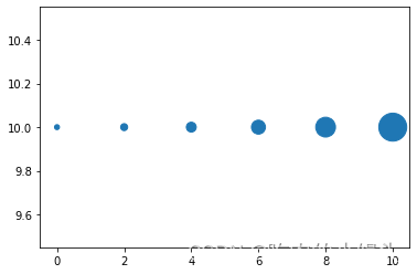
# 用scatter绘制散点图
x = [0,2,4,6,8,10]
y = [10]*len(x)
s = [20*2**n for n in range(len(x))]
plt.scatter(x,y,s=s) ;
4. images
images是matplotlib中绘制image图像的类,其中最常用的imshow可以根据数组绘制成图像,它的构造函数:
class matplotlib.image.AxesImage(ax, cmap=None, norm=None, interpolation=None, origin=None, extent=None, filternorm=True, filterrad=4.0, resample=False, **kwargs)
imshow根据数组绘制图像
matplotlib.pyplot.imshow(X, cmap=None, norm=None, aspect=None, interpolation=None, alpha=None, vmin=None, vmax=None, origin=None, extent=None, shape=, filternorm=1, filterrad=4.0, imlim=, resample=None, url=None, *, data=None, **kwargs)
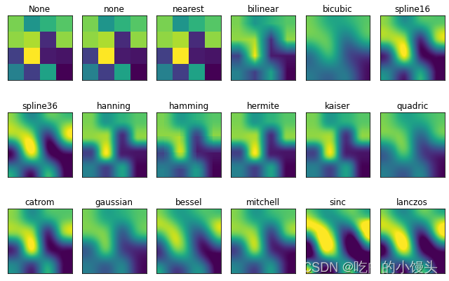
使用imshow画图时首先需要传入一个数组,数组对应的是空间内的像素位置和像素点的值,interpolation参数可以设置不同的差值方法,具体效果如下。
methods = [None, 'none', 'nearest', 'bilinear', 'bicubic', 'spline16','spline36', 'hanning', 'hamming', 'hermite', 'kaiser', 'quadric','catrom', 'gaussian', 'bessel', 'mitchell', 'sinc', 'lanczos']grid = np.random.rand(4, 4)fig, axs = plt.subplots(nrows=3, ncols=6, figsize=(9, 6),subplot_kw={'xticks': [], 'yticks': []})for ax, interp_method in zip(axs.flat, methods):ax.imshow(grid, interpolation=interp_method, cmap='viridis')ax.set_title(str(interp_method))plt.tight_layout();
三、对象容器 - Object container
容器会包含一些primitives,并且容器还有它自身的属性。
比如Axes Artist,它是一种容器,它包含了很多primitives,比如Line2D,Text;同时,它也有自身的属性,比如xscal,用来控制X轴是linear还是log的。
1. Figure容器
matplotlib.figure.Figure是Artist最顶层的container对象容器,它包含了图表中的所有元素。一张图表的背景就是在Figure.patch的一个矩形Rectangle。
当我们向图表添加Figure.add_subplot()或者Figure.add_axes()元素时,这些都会被添加到Figure.axes列表中。
fig = plt.figure()
ax1 = fig.add_subplot(211) # 作一幅2*1的图,选择第1个子图
ax2 = fig.add_axes([0.1, 0.1, 0.7, 0.3]) # 位置参数,四个数分别代表了(left,bottom,width,height)
print(ax1)
print(fig.axes) # fig.axes 中包含了subplot和axes两个实例, 刚刚添加的
由于Figure维持了current axes,因此你不应该手动的从Figure.axes列表中添加删除元素,而是要通过Figure.add_subplot()、Figure.add_axes()来添加元素,通过Figure.delaxes()来删除元素。但是你可以迭代或者访问Figure.axes中的Axes,然后修改这个Axes的属性。
比如下面的遍历axes里的内容,并且添加网格线:
fig = plt.figure()
ax1 = fig.add_subplot(211)for ax in fig.axes:ax.grid(True)
Figure也有它自己的text、line、patch、image。你可以直接通过add primitive语句直接添加。但是注意Figure默认的坐标系是以像素为单位,你可能需要转换成figure坐标系:(0,0)表示左下点,(1,1)表示右上点。
Figure容器的常见属性:
Figure.patch属性:Figure的背景矩形
Figure.axes属性:一个Axes实例的列表(包括Subplot)
Figure.images属性:一个FigureImages patch列表
Figure.lines属性:一个Line2D实例的列表(很少使用)
Figure.legends属性:一个Figure Legend实例列表(不同于Axes.legends)
Figure.texts属性:一个Figure Text实例列表
2. Axes容器
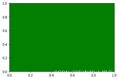
matplotlib.axes.Axes是matplotlib的核心。大量的用于绘图的Artist存放在它内部,并且它有许多辅助方法来创建和添加Artist给它自己,而且它也有许多赋值方法来访问和修改这些Artist。
和Figure容器类似,Axes包含了一个patch属性,对于笛卡尔坐标系而言,它是一个Rectangle;对于极坐标而言,它是一个Circle。这个patch属性决定了绘图区域的形状、背景和边框。
fig = plt.figure()
ax = fig.add_subplot(111)
rect = ax.patch  # axes的patch是一个Rectangle实例
rect.set_facecolor('green')
Axes有许多方法用于绘图,如.plot()、.text()、.hist()、.imshow()等方法用于创建大多数常见的primitive(如Line2D,Rectangle,Text,Image等等)。在primitives中已经涉及,不再赘述。
Subplot就是一个特殊的Axes,其实例是位于网格中某个区域的Subplot实例。其实你也可以在任意区域创建Axes,通过Figure.add_axes([left,bottom,width,height])来创建一个任意区域的Axes,其中left,bottom,width,height都是[0—1]之间的浮点数,他们代表了相对于Figure的坐标。
你不应该直接通过Axes.lines和Axes.patches列表来添加图表。因为当创建或添加一个对象到图表中时,Axes会做许多自动化的工作:
它会设置Artist中figure和axes的属性,同时默认Axes的转换;
它也会检视Artist中的数据,来更新数据结构,这样数据范围和呈现方式可以根据作图范围自动调整。
你也可以使用Axes的辅助方法.add_line()和.add_patch()方法来直接添加。
另外Axes还包含两个最重要的Artist container:
ax.xaxis:XAxis对象的实例,用于处理x轴tick以及label的绘制
ax.yaxis:YAxis对象的实例,用于处理y轴tick以及label的绘制
会在下面章节详细说明。
Axes容器的常见属性有:
artists: Artist实例列表
patch: Axes所在的矩形实例
collections: Collection实例
images: Axes图像
legends: Legend 实例
lines: Line2D 实例
patches: Patch 实例
texts: Text 实例
xaxis: matplotlib.axis.XAxis 实例
yaxis: matplotlib.axis.YAxis 实例
3. Axis容器
matplotlib.axis.Axis实例处理tick line、grid line、tick label以及axis label的绘制,它包括坐标轴上的刻度线、刻度label、坐标网格、坐标轴标题。通常你可以独立的配置y轴的左边刻度以及右边的刻度,也可以独立地配置x轴的上边刻度以及下边的刻度。
刻度包括主刻度和次刻度,它们都是Tick刻度对象。
Axis也存储了用于自适应,平移以及缩放的data_interval和view_interval。它还有Locator实例和Formatter实例用于控制刻度线的位置以及刻度label。
每个Axis都有一个label属性,也有主刻度列表和次刻度列表。这些ticks是axis.XTick和axis.YTick实例,它们包含着line primitive以及text primitive用来渲染刻度线以及刻度文本。
刻度是动态创建的,只有在需要创建的时候才创建(比如缩放的时候)。Axis也提供了一些辅助方法来获取刻度文本、刻度线位置等等:
常见的如下:
# 不用print,直接显示结果
from IPython.core.interactiveshell import InteractiveShell
InteractiveShell.ast_node_interactivity = "all"fig, ax = plt.subplots()
x = range(0,5)
y = [2,5,7,8,10]
plt.plot(x, y, '-')axis = ax.xaxis # axis为X轴对象
axis.get_ticklocs()     # 获取刻度线位置
axis.get_ticklabels()   # 获取刻度label列表(一个Text实例的列表)。 可以通过minor=True|False关键字参数控制输出minor还是major的tick label。
axis.get_ticklines()    # 获取刻度线列表(一个Line2D实例的列表)。 可以通过minor=True|False关键字参数控制输出minor还是major的tick line。
axis.get_data_interval()# 获取轴刻度间隔
axis.get_view_interval()# 获取轴视角(位置)的间隔
下面的例子展示了如何调整一些轴和刻度的属性(忽略美观度,仅作调整参考):
fig = plt.figure() # 创建一个新图表
rect = fig.patch   # 矩形实例并将其设为黄色
rect.set_facecolor('lightgoldenrodyellow')ax1 = fig.add_axes([0.1, 0.3, 0.4, 0.4]) # 创一个axes对象,从(0.1,0.3)的位置开始,宽和高都为0.4,
rect = ax1.patch   # ax1的矩形设为灰色
rect.set_facecolor('lightslategray')for label in ax1.xaxis.get_ticklabels(): # 调用x轴刻度标签实例,是一个text实例label.set_color('red') # 颜色label.set_rotation(45) # 旋转角度label.set_fontsize(16) # 字体大小for line in ax1.yaxis.get_ticklines():# 调用y轴刻度线条实例, 是一个Line2D实例line.set_markeredgecolor('green')    # 颜色line.set_markersize(25)    # marker大小line.set_markeredgewidth(2)# marker粗细
4. Tick容器
matplotlib.axis.Tick是从Figure到Axes到Axis到Tick中最末端的容器对象。
Tick包含了tick、grid line实例以及对应的label。
所有的这些都可以通过Tick的属性获取,常见的tick属性有
Tick.tick1line:Line2D实例
Tick.tick2line:Line2D实例
Tick.gridline:Line2D实例
Tick.label1:Text实例
Tick.label2:Text实例
y轴分为左右两个,因此tick1对应左侧的轴;tick2对应右侧的轴。
x轴分为上下两个,因此tick1对应下侧的轴;tick2对应上侧的轴。
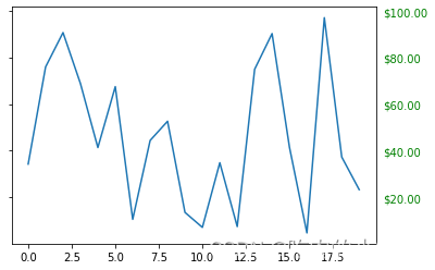
下面的例子展示了,如何将Y轴右边轴设为主轴,并将标签设置为美元符号且为绿色:
fig, ax = plt.subplots()
ax.plot(100*np.random.rand(20))# 设置ticker的显示格式
formatter = matplotlib.ticker.FormatStrFormatter('$%1.2f')
ax.yaxis.set_major_formatter(formatter)# 设置ticker的参数,右侧为主轴,颜色为绿色
ax.yaxis.set_tick_params(which='major', labelcolor='green',labelleft=False, labelright=True);