

Day1:垂直水平居中方式(至少6种,必须包含弹性盒子)
创始人
2024-01-18 20:30:25
目录
垂直水平居中方式
方式1:弹f性盒子(1) (推荐)
方式2:弹性盒子(2) (推荐)
方式3:弹性盒子(3)
方式4:grid布局(1) (推荐)
方式5:grid布局(2)
方式6:通过父相子绝,子元素设置绝对定位,父元素设置相对定位。 定位+margin (推荐)
方式7:绝对定位+transform属性 (推荐)
方式8:绝对定位+calc()函数 宽高要固定 (推荐)
方式8:table-cell 表格单元 只对(行内块元素有效)
方式9:单行文本居中
垂直水平居中方式
公共样式:
.far{width: 400px;height: 400px;background-color: skyblue;}.son{width:100px ;height: 100px;background-color: pink;} 方式1:弹f性盒子(1) (推荐)
.farCenter{/* 设置为弹性盒子 */display: flex;/* 水平居中 */justify-content: center;/* 垂直居中 */align-items:center;}
.childCenter{}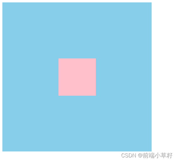
方式2:弹性盒子(2) (推荐)
 .farCenter{/* 设置为弹性盒子 */display: flex;}
.childCenter{/* margin:auto auto auto auto; */margin: auto;}
方式3:弹性盒子(3)
利用子元素的align-self:center , 如果父元素设置了 align-items:center;就会覆盖掉。
.farCenter{/* 设置为弹性盒子 */display: flex;}.childCenter{/* 子元素垂直居中 */align-self: center;/* 子元素水平居中 */margin: 0 auto;}方式4:grid布局(1) (推荐)
.farCenter{display: grid;}.childCenter{margin:auto;}方式5:grid布局(2)
.farCenter{display: grid;}.childCenter{/* 水平居中 */justify-self: center;/* 垂直居中 */align-self: center;}方式6:通过父相子绝,子元素设置绝对定位,父元素设置相对定位。 定位+margin (推荐)
.farCenter{/* 所有定位都是基于父亲的 */position: relative;}.childCenter{/* 绝对定位会脱离文档流 */position:absolute;left:0;right:0;top:0;bottom:0;margin:auto;}原理:
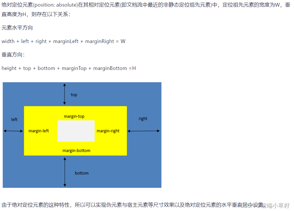
具体原理去到这个链接:
绝对定位元素left、right、top、bottom值与其margin和宽高的关系 - 请叫我二狗哥 - 博客园 (cnblogs.com)
方式7:绝对定位+transform属性 (推荐)
.farCenter{/* 所有定位都是基于父亲的 */position: relative;}.childCenter{/* 绝对定位会脱离文档流 */position:absolute;/* 向右移动相对于父元素宽度的50% */left:50%;/* 向下移动相对于父元素高度的50%*/top:50%;/* 移动 子元素相对于自身的宽度高度往左和往上移动50%*/transform: translate(-50%,-50%);}方式8:绝对定位+calc()函数 宽高要固定 (推荐)
.farCenter {position: relative;}.childCenter {position: absolute;/* 50%是相对于父元素宽度的50%,50px是子元素本身宽度的一半 *//* 如果不减去50px的话,元素整体会偏下,不会居中 */top:calc(50% - 50px);left:calc(50% - 50px);}方式8:table-cell 表格单元 只对(行内块元素有效)
所以子元素要设置为行内块模式。
.farCenter{/* 表格单元 */display: table-cell;/* 垂直居中 */vertical-align: middle;/* 水平居中 */text-align:center;}.childCenter{display: inline-block;}方式9:单行文本居中
.online{width: 600px; height: 100px;background-color: pink;/* 水平居中 */text-align: center;/* 垂直居中 */line-height: 100px;}单行文本垂直居中
相关内容
热门资讯
埃菲尔铁塔在哪 中国仿建埃菲尔...
2019年4月26日,广西南宁市,街头惊现一座巨型山寨版埃菲尔铁塔,高约20米,白色塔身,造型逼真,...
苗族的传统节日 贵州苗族节日有...
【岜沙苗族芦笙节】岜沙,苗语叫“分送”,距从江县城7.5公里,是世界上最崇拜树木并以树为神的枪手部落...
苁蓉的食用方法 鲜苁蓉的吃法有...
肉苁蓉号称“温而不热,补而不峻,暖而不燥,滑而不泄,故有从容之名。”历来也是传统药食同源的滋补佳品。...
北京的名胜古迹 北京最著名的景...
北京从元代开始,逐渐走上帝国首都的道路,先是成为大辽朝五大首都之一的南京城,随着金灭辽,金代从海陵王...
应用未安装解决办法 平板应用未...
---IT小技术,每天Get一个小技能!一、前言描述苹果IPad2居然不能安装怎么办?与此IPad不...
脚上的穴位图 脚面经络图对应的...
人体穴位作用图解大全更清晰直观的标注了各个人体穴位的作用,包括头部穴位图、胸部穴位图、背部穴位图、胳...
长白山自助游攻略 吉林长白山游...
昨天介绍了西坡的景点详细请看链接:一个人的旅行,据说能看到长白山天池全凭运气,您的运气如何?今日介绍...
猫咪吃了塑料袋怎么办 猫咪误食...
你知道吗?塑料袋放久了会长猫哦!要说猫咪对塑料袋的喜爱程度完完全全可以媲美纸箱家里只要一有塑料袋的响...
世界上最漂亮的人 世界上最漂亮...
此前在某网上,选出了全球265万颜值姣好的女性。从这些数量庞大的女性群体中,人们投票选出了心目中最美...
埃菲尔铁塔在哪 中国仿建埃菲尔...
2019年4月26日,广西南宁市,街头惊现一座巨型山寨版埃菲尔铁塔,高约20米,白色塔身,造型逼真,...
阳澄湖在哪里哪个省的 阳澄湖是...
点击题目下方苏州生活指南有用 有趣 有态度近期的阳澄湖度很高,3月24日,央视二套《第一时间》直播连...
苗族的传统节日 贵州苗族节日有...
【岜沙苗族芦笙节】岜沙,苗语叫“分送”,距从江县城7.5公里,是世界上最崇拜树木并以树为神的枪手部落...
北京的名胜古迹 北京最著名的景...
北京从元代开始,逐渐走上帝国首都的道路,先是成为大辽朝五大首都之一的南京城,随着金灭辽,金代从海陵王...